Alesha Dixon Brand Launch
George.com
e-commerce, children clothing, brand launch, video, graphic elements, logo creation, landing page, banners, gifs
The exclusive Alesha Dixon brand range has a fun, youthful character that captures the essence of her kids’ fashion range for you. It combines a set of playful graphic assets with the fun model photography to create bright and engaging graphics with a bold, distinctive style.
Brief
George.com has teamed up with Alesha Dixon to create a brand that captures her kids' fashion range. For the launch, they requested bold and bright designs that would capture interest, while remaining positive and playful.

Imagery
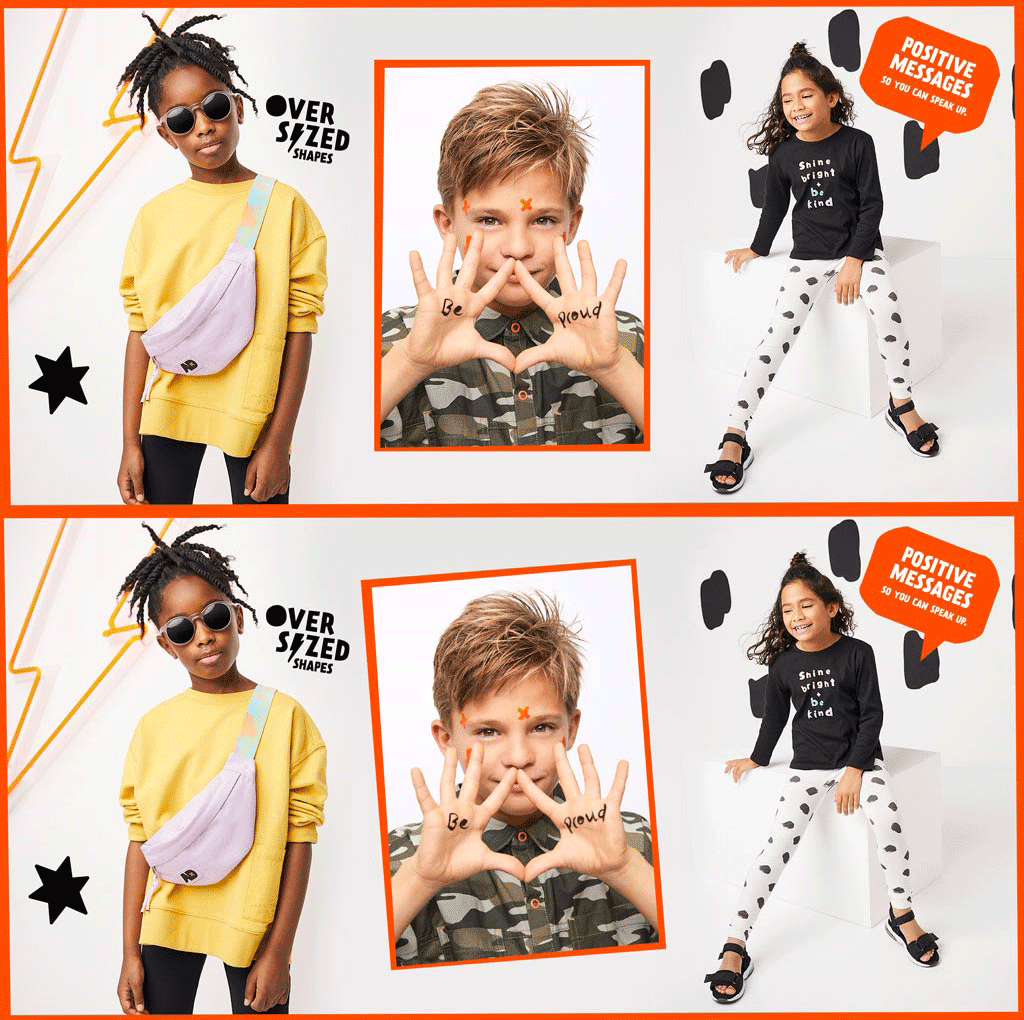
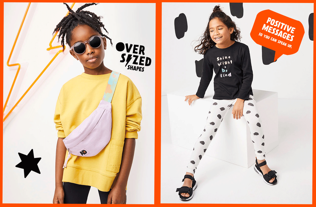
Playful prints, oversized shapes and positive messages was the keywords when shooting the images for George's latest brand launch. Drawing inspiration from the clothing, backgrounds props such as bigger dots and orange lightning bolts against a white background was used.


Colour Palette
The colour palette is grounded in core classic tones of black and white that can be built on as the collection develops through the year.
Secondary shades of orange and pastel lilac. Orange gives it that pop of colour to draw attention, while the soft lilac compliments the imagery.
Primary
Black
White
Secondary
Orange
Lilac
Typography
Prater was chosen for its playful, irregular personality. It is the font that is used for the Alesha Dixon brand statement as well as all other brand related messages. However, George related information such as price points was kept in Lato and Avenir.

Master brand logo
Using the playful and irregular Prater font as a base, the letters were filled in to create a completely unique logo.
The letters X and O have a distinguished orange drop shadow to call out the common use of hugs and kisses in a digital environment. Further emphasizing the positive messages the brand wants to express.


Brand shapes
& messages
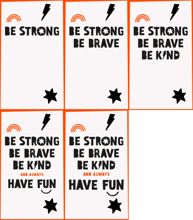
To compliment the fun, playful character of the Alesha Dixon brand, a selection of bold shapes were designed.
The shapes are flexible and intended to add personality in multiple ways and create engaging designs. They were made as holding shapes to contain messages or used separately as graphic embellishments.

Patterns
Available in both positive and negative versions, the pattern is a fun texture inspired by the product,
that is used to add brand personality to the designs.
The pattern is a flexible design asset that can be used whole, partly (zoomed in) or as a border.

Video
Video showcasing behind the scenes of the photoshoot and Alesha Dixon speaking about the collection.
Mobile and desktop versions of the video was created to be shared for social media, but also to be used on George.com.
Final Design & Results
Combining typography, skewed orange, frames, the joyful imagery and bold colours. A playful launch was created with lots of dynamic content and positive messages.
The launch was so successful that products sold out after 2 days of being put online. Making very happy clients who've otherwise seen a downfall in clothing revenue since the start of the COVID-19 pandemic.

Landing page desktop
2
DAYS FOR ITEMS TO BE SOLD OUT

Landing page mobile


Category landing pages banners


Product landing pages banners


Website banners

